Word Accessible Documents
Table of Contents
- Introduction
- Task: Run the MS Word “Accessibility Checker”
- Task: Format Word Documents using “Styles” instead of Custom Formats
- Task: Use “headings” to Provide Structure in your Text
- Task: Create Descriptive Hyperlinks
- Task: Add “Alt Text” to Images
- Task: Make data tables accessible
- Suggested Resources
- Relevant OSCQR Standards
- Bibliography
Introduction
Microsoft Word is frequently used for creating content for online classes and is a standard application at FDU. When formatting your “Word” documents, you should use some basic formatting techniques and tools such as the Word “Accessibility Checker” to make them more accessible to people with disabilities and compatible with assistive software such as screen readers.
Task: Run the MS Word “Accessibility Checker”
The “Accessibility Checker” in MS Word provides you with a report on formatting issues in your document that could make it difficult to read for people with disabilities. You should run the “Accessibility Checker” in Word prior to publishing Word files in your online course.
To run the Accessibility Checker in both the MS Word desktop app and the Web-based client, open the “Review” tab on the ribbon and click, “Check Accessibility” (Figure 1). Note that this procedure is the same for both Mac and PC.
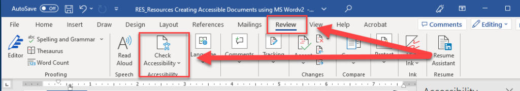
Figure 1: Running the “Accessibility Checker” in MS Word 365 for Windows.
For a concise overview of how the “Accessibility Checker” works in MS Word for Windows, watch:
- Office 365 Support – Check document accessibility in Word (1:11)
The following tasks characterize things that you can do while formatting your Word documents that will address common accessibility issues.
Task: Format Word documents using “Styles” instead of custom formats
As a general best practice, use “Styles” to format your text (Figure 2).
The default “Style Set” stylesheet themes included by Microsoft in MS Word should be relatively accessible in terms of text size, font, and color.
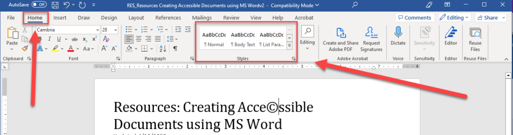
Figure 2: The “Styles” tool in the MS Word ribbon.
Avoid creating “custom” formats unless necessary (Figure 3). Using custom fonts, font sizes, and color to format text should be done judiciously.
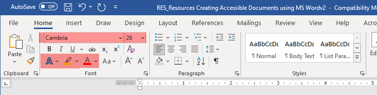
Figure 3: “Custom” formatting tools in MS Word (highlighted).
To select different “Style set” themes to use with your document, open the “Design” tab and select a different stylesheet based on your preferences (Figure 3).
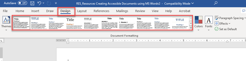
Figure 4: Selecting a different “Style Set” from the “Design” tab.
To clear formatting from your text or text that you’ve “pasted” from another document so that you can apply a new “Style”, select the text and use the “Clear all formatting” button (Figure 4).
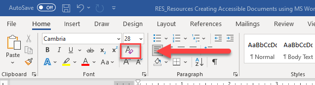
Figure 5: the “Clear Formatting” button.
Task: Use “headings” to provide structure in your text
Use “headings” to create separation between long stretches of text (Figure 4) by highlighting text and selecting a heading “style” from the ribbon.
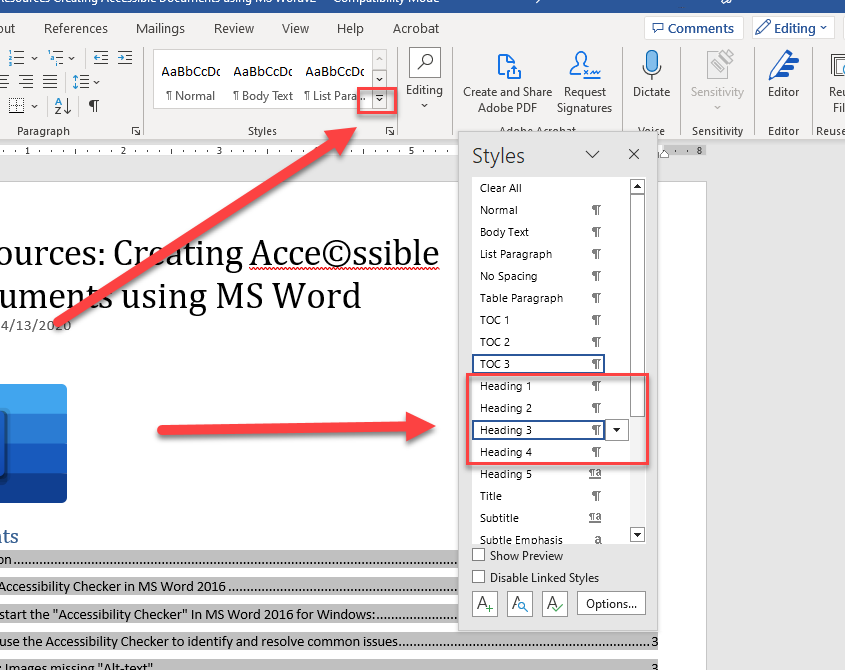
Figure 6: Selecting styles.
For more information and a concise summary of how headings can be used in a Word document to improve accessibility, watch:
- Microsoft Support– “Improve accessibility with heading styles” (1:26)
When using “headings” in your document, there should only be one “heading 1” in the document, and subsequent “headings” should be used consistently in a hierarchal manner (e.g., “heading 2” is a major sub-section, “heading 3” is a sub-section of “heading 2”, etc.).
Task: Create descriptive hyperlinks
Avoid simply “pasting” a URL into your document when posting hyperlinks to outside Web sites for your students, e.g.:
Instead, you should create “descriptive” hyperlinks where the text that is displayed to your students tells them something about the target Web site, e.g.:
To create a hyperlink, open the “Insert” menu from the ribbon and use the “Link” tool to insert a properly formatted hyperlink (Figure 5):
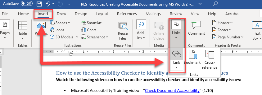
Figure 7: Opening the “Link” tool from the “Insert” tab to insert a hyperlink into a document.
For a concise summary of how to convert URL’s into descriptive hyperlinks in MS Word, watch:
Microsoft 365 Support – “Create Accessible Links in Word” (2:09)
Task: Add “Alt Text” to images
Per Microsoft support:
- “Alt Text helps people with visual impairments understand pictures and other graphical content. When someone uses a screen reader to view documents, they will hear Alt Text; without Alt Text, they will only know they’ve reached a picture without knowing what the picture shows. (Microsoft, 2022)”
For a concise description of how to add “Alt-text” to images in MS Word, watch:
- Microsoft 365 support – Improve Accessibility with Alt Text (2:08)
Task: Make data tables accessible
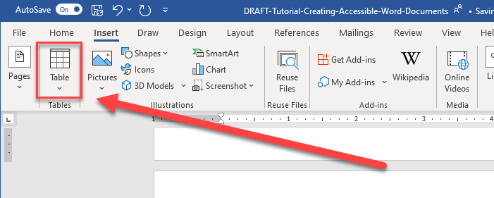
Figure 8: The “Insert > Table” tool.
Tables in MS Word should be used with discretion and kept simple and data oriented.
For a concise description of how to use Tables in an accessible manner, watch:
If you are interested in learning more about creating accessible documents, visit, “WebAIM” (“Web Accessibility in Mind”).
Suggested Resources
Microsoft Support
- Creating accessible content with Microsoft 365
- Create or Edit a Hyperlink
- Add alternative text to a picture, shape, chart, SmartArt graphic, or table
WebAIM
Relevant OSCQR Standards
- OSCQR – STANDARD #18: “There is enough contrast between text and background for the content to be easily viewed.”
- OSCQR – STANDARD #21: “Text is formatted with titles, headings, and other styles to enhance readability and improve the structure of the document.”
- OSCQR – STANDARD #23: “A sans-serif font with a standard size of at least 12 pt is used.”
- OSCQR – STANDARD #24: “When possible, information is displayed in a linear format instead of as a table.”
- OSCQR – STANDARD #37: “Hyperlink text is descriptive and makes sense when out of context (avoid using “click here”).”
- OSCQR – STANDARD #35: “A text equivalent for every non-text element is provided (“alt” tags, captions, transcripts, etc.), and audio description is provided for video-only content.”
Bibliography
Microsoft. (2022, 12 20). Add alternative text to a shape, picture, chart, SmartArt graphic, or other object. Retrieved from Microsoft 365 support: https://support.microsoft.com/en-us/office/add-alternative-text-to-a-shape-picture-chart-smartart-graphic-or-other-object-44989b2a-903c-4d9a-b742-6a75b451c669?redirectSourcePath=%252fen-us%252farticle%252fAdd-alternative-text-to-a-picture-shape-chart-Smar
This resource was developed by the Office of Educational Resources and Assessment.