University Logo and Seal
University Logo
The University logo is a combination of the words Fairleigh Dickinson University in the traditional serif typeface Adobe® Caslon Pro, along with the University shield, reflecting the University’s historic roots. The original University shield was designed by the late Loyd Haberly, distinguished professor of English.
The roses designate the Florham Campus in Madison, N.J., because Madison is often called the Rose City. The swan is a riverine symbol for the Metropolitan Campus, Teaneck, N.J., which sits astride the Hackensack River.
The battlemented band across the shield represents the Castle on the former Rutherford Campus, the site of the University’s founding. The four towers on the band represent the University’s four current campuses (Metropolitan Campus, Florham Campus, and Vancouver Campus/Vancouver, British Columbia, Canada).
The motto, Fortiter et Suaviter, while subject to varying interpretations, was translated by the University founder Peter Sammartino as “Bravely and Pleasurably.”
The logo pictured in Illustration A (see banner above) is the boldest representation of the University identity and, whenever possible, it should be used in print and Web applications.
Illustration B shows the use of the logo with a secondary brand. This is the University’s desired way for colleges, schools, and departments to personalize the University identity.
The shield is an integral part of the University logo and the official University seal and is not designed to be used as a freestanding graphic.
University Seal
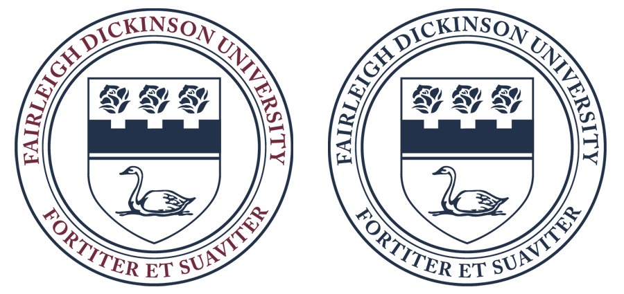 The University seal is the more formal representation of the University identity and is reserved primarily for presidential documents, legal papers, University citations, and diplomas. Do not use the seal for social media purposes or without direct approval from the Office of Communications.
The seal is also a key element in the University signage program because its size fits neatly on both welcome signs and building-identification signs.